The concept of ’Union‘ draws from its literal meaning - union, alliance, and connection.
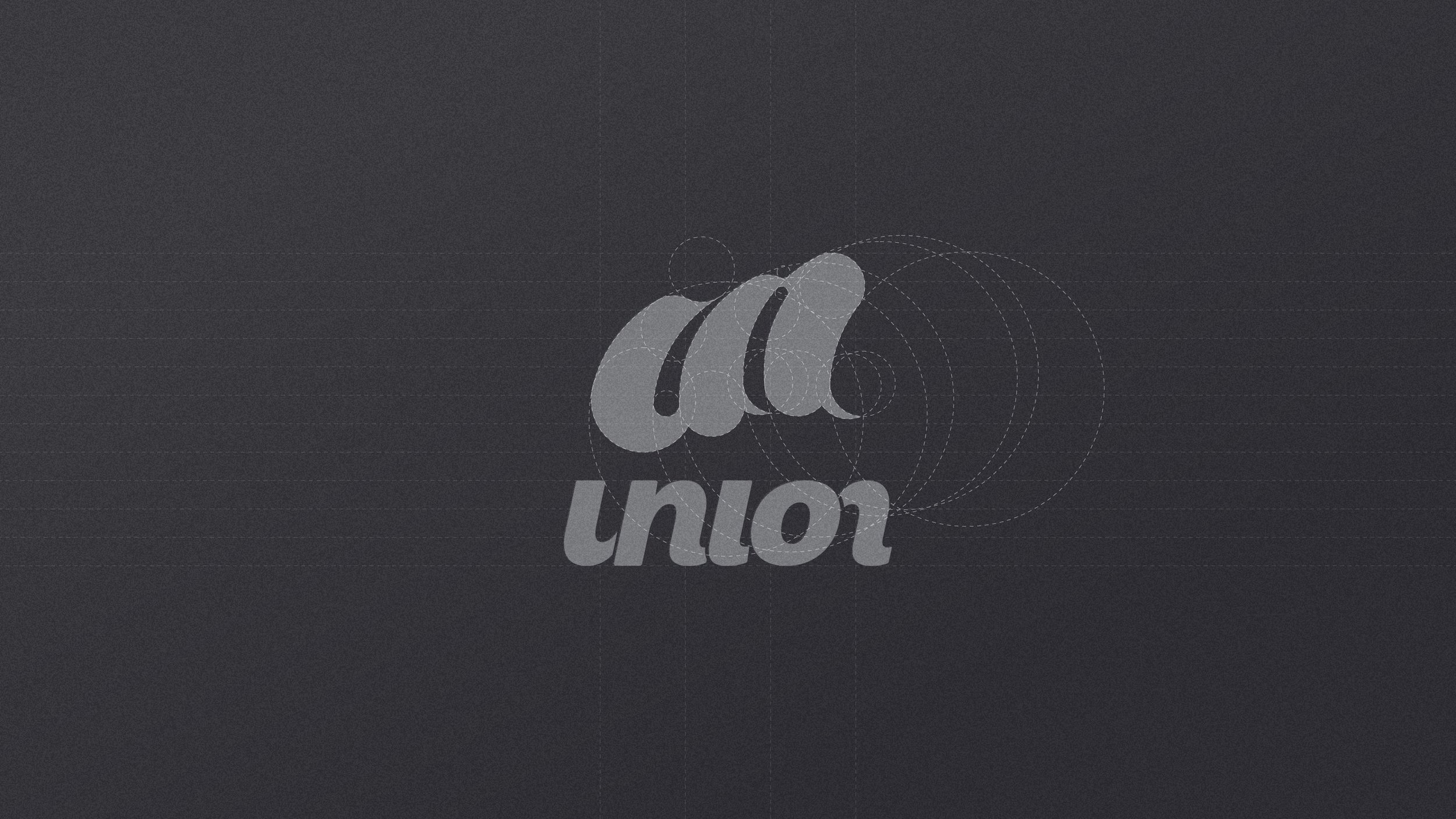
The visual system is established through precise geometric construction.
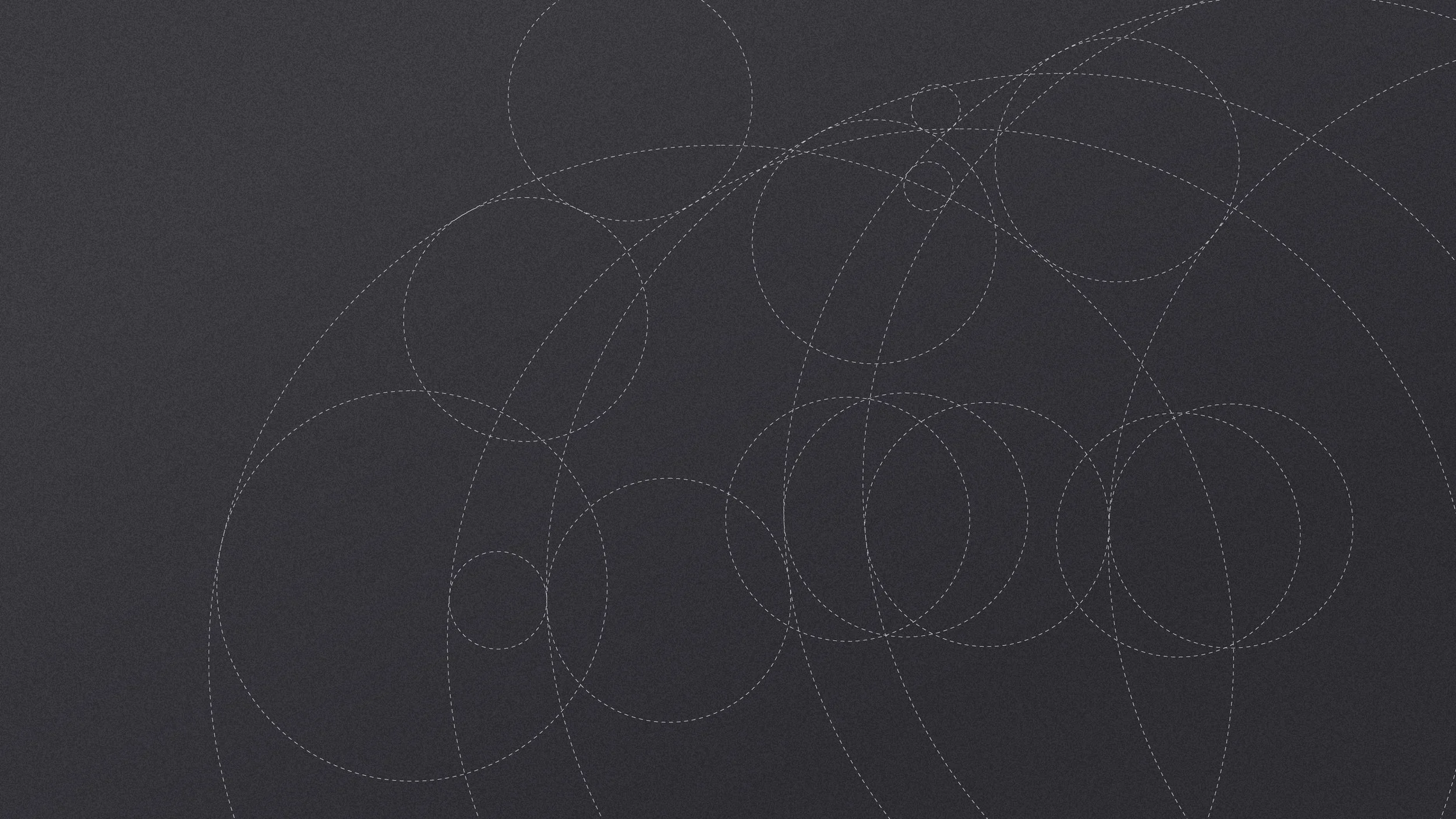
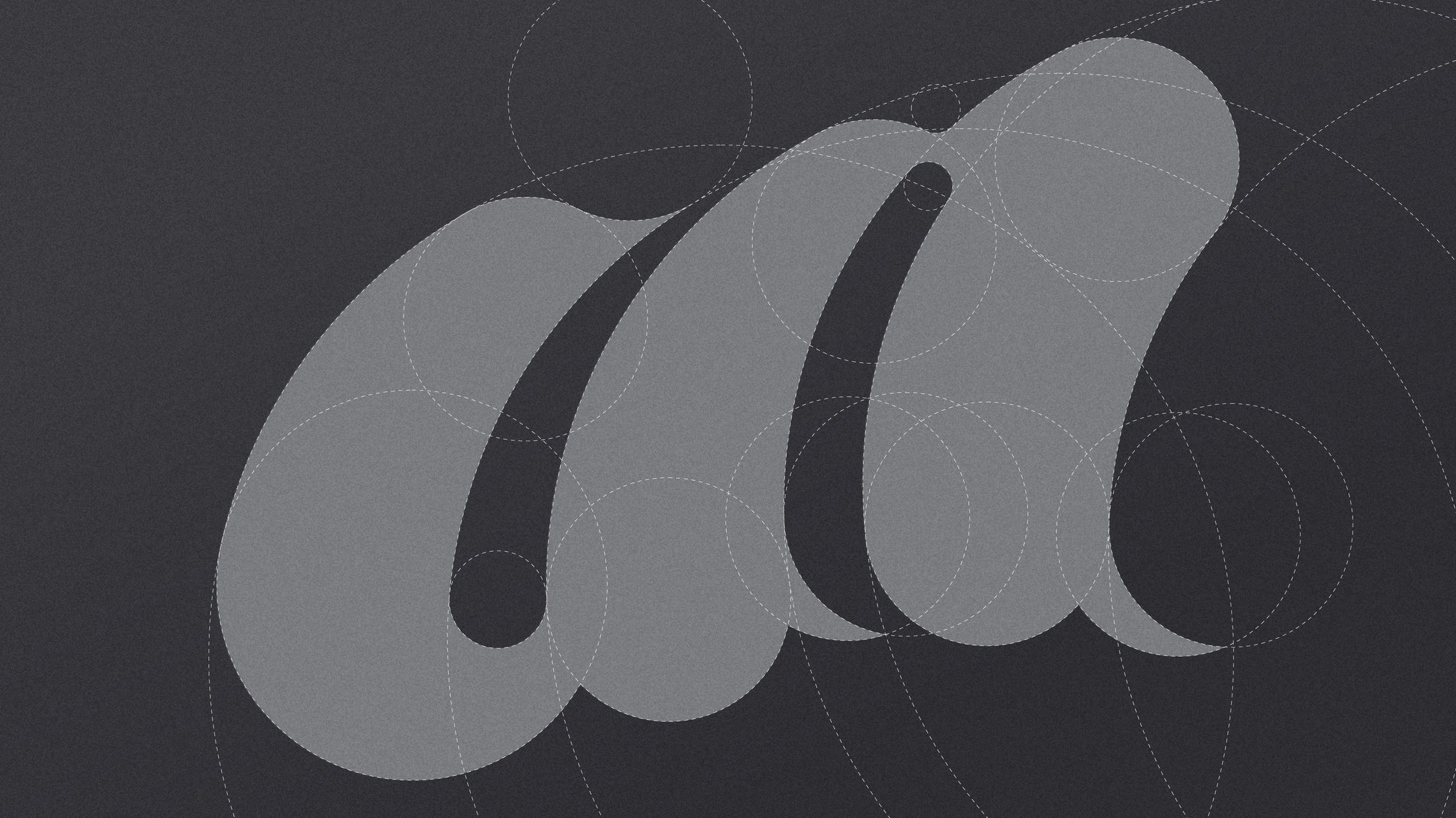
The Logomark is built upon circles derived from the Golden Ratio, establishing visual balance through rigorous geometric principles.
In the design of the custom Logotype, a symmetrical bisection is applied to the letters ’U‘ and ’n‘, ensuring a sense of regularity and high legibility. The precise layout of every proportion ensures visual accuracy across all brand communications.
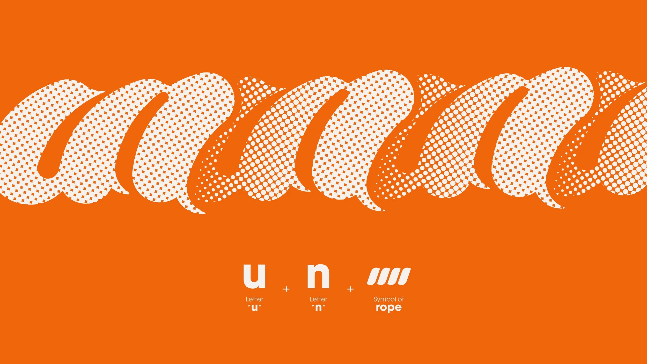
Visually interpreted through the motif of intertwined ropes and knots, it symbolizes the binding together of the three tattoo studios into one cohesive entity.
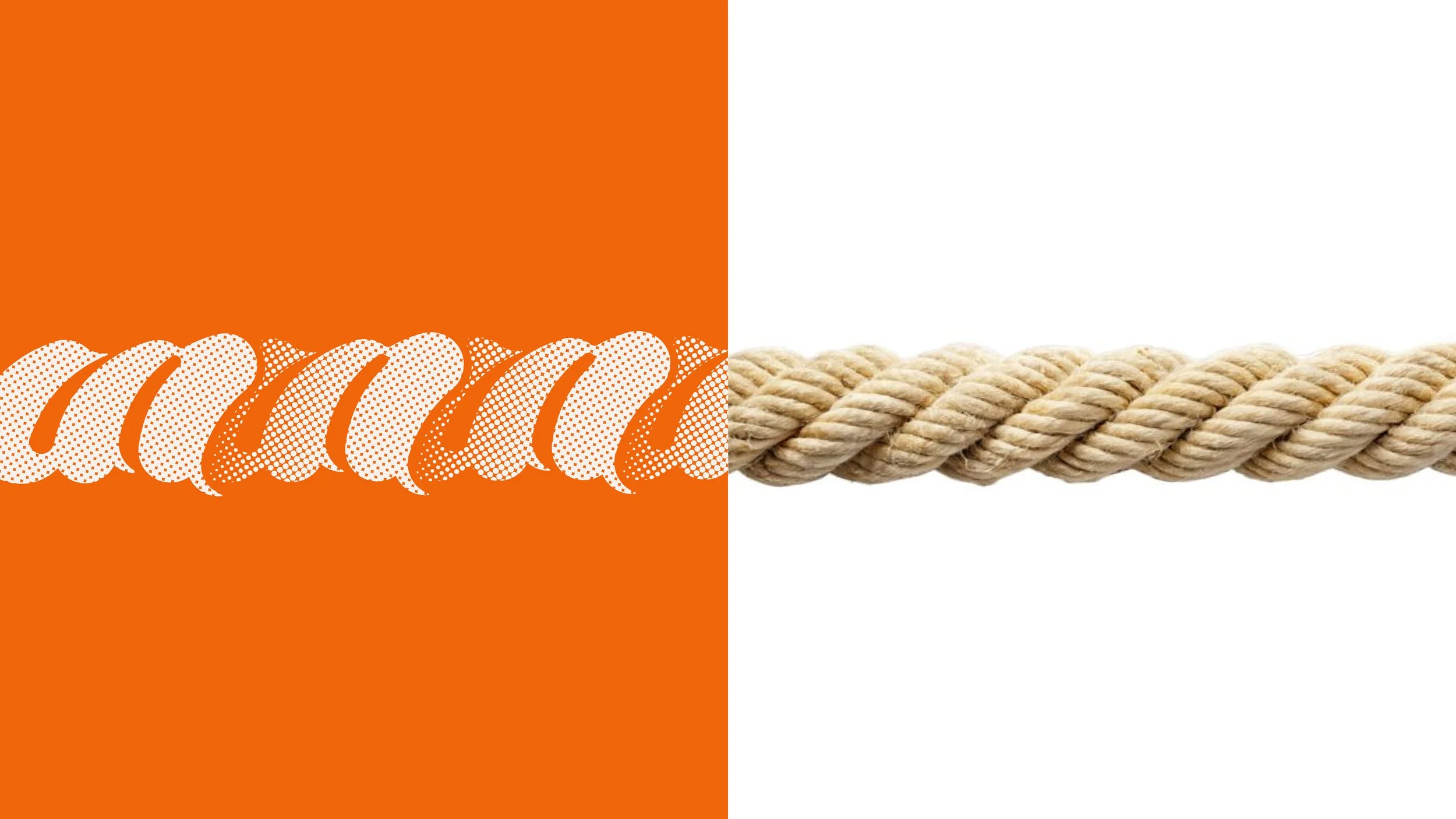
When the pattern elements are combined, they form a continuous, unbroken rope, representing unbreakable unity and collective strength.
Co-founder
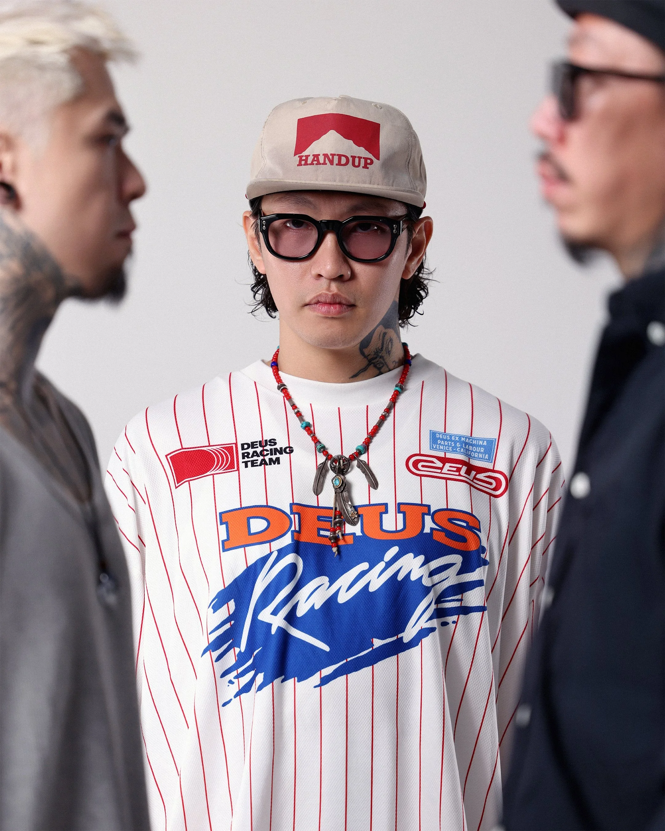
Jamie Kam
Our vision goes beyond the local scene. We plan to hit up top global tattoo conventions and engage in international art exchanges, bringing the freshest ideas back to Hong Kong while pushing our local creativity onto the world stage. We want everyone who walks into UNION to experience a globally connected art culture.
Friday's Tattoo HK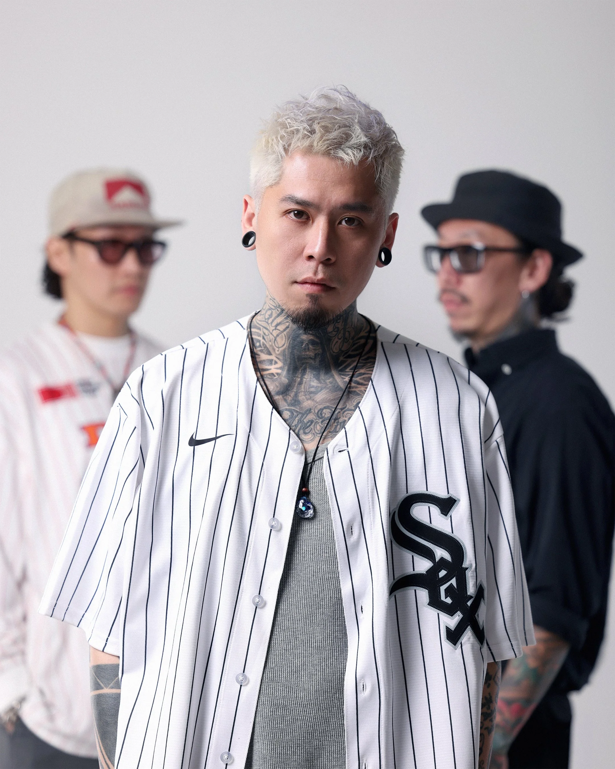
Andy Chan
UNION is no longer just a tattoo shop; it is a dedicated crew of people with the exact same beliefs, creating endless possibilities together. A big thank you to everyone who has supported us along the way. See you on this exciting new journey. UNION is officially setting sail, and it all starts with one shared belief: We Are UNION.
Crack Tattoo Workshop
We want to extend this connection to more talented artists, diverse cultures, and every client seeking a unique experience. Through technical innovation, global exchanges, and cross-industry collabs, we are making UNION a truly special brand. Don't just get a tattoo—be part of our culture. Let's hang out, have fun, and share the pain together.
Pd Tattoo HKJel chan
The inspiration for this instrumental theme song comes from the inner world of our tattoo artists. The melody begins with a touch of melancholy, yet it carries a deep sense of hope.
It is a creative way to release inner feelings. After the emotional storm passes, there is always a bright and clear sky. We deeply thank SILVERSTRIKE for this creation, which captures the true soul of our brand through music.